

Welcome to our guide on “What Font is Digital Clock?” Digital clock fonts are ubiquitous in modern technology, appearing on clocks, watches, and various digital displays. These fonts are characterised by their segmented, easy-to-read design, making them ideal for conveying time accurately and clearly. In this article, we will explore the history, characteristics, and common types of digital clock fonts. Understanding these fonts can enhance your design projects and improve user experience. Whether you are a designer, a tech enthusiast, or simply curious, this guide will provide valuable insights into the unique world of digital clock typography. Keep reading to discover more about these iconic fonts.
History of Digital Clock Fonts
The history of digital clock fonts dates back to the mid-20th century with the advent of electronic digital clocks. Early digital clocks utilised seven-segment displays, a design that has become synonymous with digital timekeeping. These displays, made up of LED or LCD segments, formed the basis for digital clock fonts. As technology advanced, so did the complexity and variety of these fonts. The introduction of dot-matrix displays allowed for more intricate and varied typefaces, further refining the digital clock aesthetic. Innovations in display technology and typography have continued to influence digital clock fonts, making them a staple in both functional and decorative digital interfaces.
Characteristics of Digital Clock Fonts
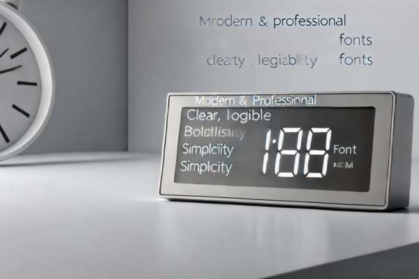
Digital clock fonts are defined by their key features: segmented displays and simplicity. These fonts typically use a seven-segment display format, where each digit is constructed from a combination of lit and unlit segments, creating a clear and minimalist appearance. This design ensures optimal readability, even from a distance or in low-light conditions. The straightforward nature of digital clock fonts makes them highly functional, as users can quickly and easily discern the time. Their simplicity also contributes to a modern, uncluttered aesthetic, which is why they are widely used in clocks, digital displays, and various electronic devices. These characteristics make digital clock fonts an ideal choice for both functionality and design.
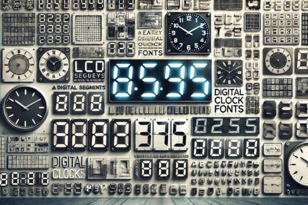
Common Digital Clock Fonts
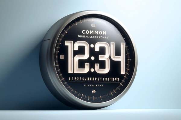
Common digital clock fonts include “DS-Digital,” “Digital-7,” and “Alarm Clock.” “DS-Digital” is a classic choice, known for its clear, segmented style that mimics traditional LED displays. “Digital-7” offers a modern twist with a slightly rounded design, enhancing readability while maintaining a sleek look. “Alarm Clock” features bold, thick segments that stand out, perfect for high-contrast displays. Each font is designed to maximise legibility and functionality, making them popular in digital clocks, watches, and various electronic displays. These fonts not only serve practical purposes but also add a touch of digital nostalgia and contemporary flair to any project.
How Digital Clock Fonts are Created

Digital clock fonts are created using grid systems and segment displays to ensure clarity and readability. The design process involves dividing the display into a grid, where each segment lights up to form numbers. These segments typically include seven or fourteen parts, enabling the creation of digits 0-9. Technical considerations include the size and spacing of segments, ensuring they are easily readable from a distance and under various lighting conditions. The simplicity and consistency of this design are crucial for functionality, making digital clock fonts a reliable choice for timekeeping devices. Understanding this process highlights the precision and practicality behind digital clock typography.
Applications of Digital Clock Fonts
Digital clock fonts find extensive use in various applications, including clocks, watches, and digital displays. These fonts serve as essential elements for electronic devices, providing clear and easy-to-read time displays. Beyond timekeeping, digital clock fonts enhance design projects, adding a modern, tech-savvy look to websites, apps, and user interfaces. They also appear in digital signage, dashboard displays, and gaming interfaces, boosting readability and aesthetic appeal. Their distinct, segmented style makes them favorites for projects requiring a futuristic or minimalist design. Understanding the applications of digital clock fonts allows you to leverage their versatility and functionality in diverse design contexts.
Advantages of Using Digital Clock Fonts
Digital clock fonts offer several advantages, making them popular in various applications. Their primary benefit is readability; the segmented design ensures clear and easy-to-read numbers, even from a distance. Additionally, these fonts provide a modern appearance, appealing to contemporary design aesthetics. Versatility is another key advantage; digital clock fonts can be used in clocks, digital interfaces, watches, and various other devices. Their simplicity and clarity enhance user experience by providing precise and quick time reading. Whether in high-tech gadgets or minimalist designs, digital clock fonts improve functionality and visual appeal, making them an excellent choice for digital products.
Customization and Variations
Customize digital clock fonts to suit various design needs, offering flexibility and creativity. Designers adjust the style, making the font more modern or classic to match the project’s theme. Modify thickness from thin, sleek lines to bold, impactful segments, enhancing readability and aesthetic appeal. Add color variations to blend the font seamlessly with the overall design palette. Experiment with these elements to create unique digital clock displays that stand out while maintaining clarity and functionality. Customizing digital clock fonts ensures they align perfectly with your design vision and user requirements.
How to Choose the Right Digital Clock Font

Choosing the right digital clock font is crucial for ensuring readability and aesthetic appeal in your projects. Start by considering readability: the font should be clear and legible from a distance. Next, think about the aesthetic appeal: the font should match the overall design style of your project, whether it’s modern, retro, or minimalist. Context of use is also important a digital clock font for a children’s app might be different from one used in a professional setting. Popular options like “DS-Digital” or “Digital-7” offer a classic look, while customizable fonts can provide a unique touch. By balancing these factors, you can select the perfect digital clock font for any application.
Conclusion
In conclusion, understanding “What Font is Digital Clock?” can greatly enhance your design projects and digital interfaces. Digital clock fonts, with their clear, segmented design, are ideal for readability and functionality. Whether you’re working on a modern tech device, a retro-themed project, or any application requiring precise time display, selecting the right font is essential. Consider factors like readability, aesthetic appeal, and context of use to ensure your chosen font meets your needs. By exploring popular options and customization possibilities, you can find the perfect digital clock font to enhance your project’s visual and functional appeal.